ROB LILLY INTERVIEW
Character Designer
Tuesday, February 07, 2006
BROUGHT TO YOU BY THE CHARACTER DESIGN BLOGSPOT
IF YOU WOULD LIKE TO SEE MORE CHARACTER DESIGNERS GO TO THE HOME PAGE BY CLICKING HERE
THE INTERVIEW
Tell me a little bit about yourself, about your life?
I was born and raised in Riverview Michigan just 20 minutes south of Detroit. I started out like every other kid drawing on anything I could find. You know the usual, construction paper, bedroom walls (do at your own risk!), shrinky dinks, envelopes and any ole’ scrap paper I could find. But I didn’t take art serious until after high school it was just a way to escape the boredom of math and english classes. Most of my homework consisted of wrong answers and doodles in the margins so I knew I wasn’t going to be saving the world from a plague or discovering a new constellation, but maybe I could make a few people laugh with a drawing or two (definitely not the teachers)! Now I’m living here in Los Angeles with my wonderful wife and two children.
Where did you go to school, and what classes did you study?
After high school I didn’t know what direction to go I just knew I wanted to draw. At that time there wasn’t a school in Michigan that offered animation classes just commercial and automotive. So for me I thought the most logical and affordable place to enroll would be at Henry Ford Community College studying graphic design. After my second year there one of my teachers brought in a Animation Magazine. Once I opened that magazine
What helped prepare you to become the artist that you are today?
Ha! Countless bad drawings and the drive to push forward through the piles of rejection letters. Also working in this industry you are surrounded by super talented artists so I would have to say that my fello co-workers are what influence me the most not to mention a supportive family.
How do you go about designing a character, and what goes through your mind, from start to end?
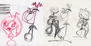
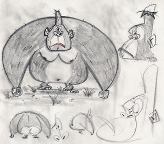
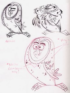
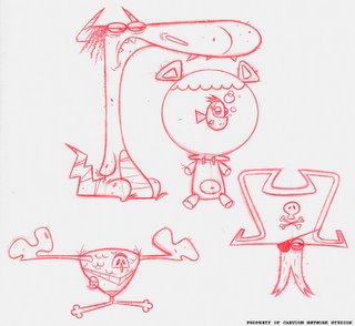
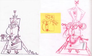
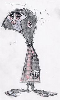
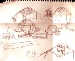
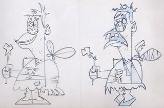
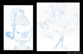
First, who is the character and what are his or her motivations. After that is established I blast out a bunch of thumbnails using bold shapes defining the character. It could be pages of facial sketches or full body sketches depending on how the character fits in the story. If it‘s a main I like to do a lot of facial sketches so I can get in the head of that particular character. Once I have something that looks decent, I’ll give that face a body on a separate piece of paper as an overlay playing with different poses, body proportions or whatever. This is only an exploratory stage so I try not to get involved in the details at this point. After I find the perfect match I’ll tie it all together on another sheet of paper to make it seamless. It’s really hit and miss for me, but there might be times where I can nail down a character in a couple passes, but most of the time I takes countless passes, which for me is where all the fun lies.
Once I have something to work with I’ll clean up the drawing using a either a pencil or simply scan it in using the line tool in flash or a hybrid of illustrator and flash combined. I like the ease of the vector programs. I can apply different textures to the lines in illustrator and drop in the color in a matter of minutes. On the plus side if I make a mistake, and I make a lot, I can always hit those wonderful keys “Ctrl Z“.
What do you think really helps you out in designing a character?
For me it’s knowing who or what you’re drawing. Sounds simple but really researching the characters background, wardrobe, personality traits can add so much to the design. So many people just rattle off something from the top of their head, I know ‘cause I’ll do it from time to time when deadlines are crunching down on me. If I’m drawing a croc tap dancing I’ll search the internet for crocs and tap dancing. I’ll study the visuals and maybe some mannerisms, giving the character a more convincing look.
From your own experience and maybe from some people that you know, what should we put in our portfolio and what should we not?
For a character designer I think you should primarily put in your best character designs not bgs or props, but your best bet is to contact the studio you’re applying for. 15-20 pages should be more than enough for anyone to get an idea of your skill level. I’m a big fan of less is more. Just throw in enough that will grab their attention. Versatility is key in design, but if your applying for a show with a certain look, gear your stuff in that particular style with a couple of color comps, a page or two of turnarounds and maybe a page of expressions and the rest filled with action/ attitude poses.
I’ve been in a few reviews where they just raced threw the portfolios. So remember that your first page should be your strongest. If it’s a weak one in the front they’re more likely to toss it off to the side and move on to the next giving you that dreadful letter stating: “Thank you for your submission, however the position that you applied for has been filled. We will keep your file on record for any future positions that fit you skill level here at bla,bla,bla…I love that one!
What are some of the things that you have worked on?
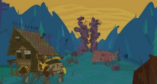
My first gig out here was on Roughneck Chronicles (Starship Troopers animated series) and Maxx Steel over at Sony . Other show would include-
Is there a character design you have done that you are most proud of?
Ha! I’ll let ya know when that one pops up. I’m usually proud of the last drawing I do, but that fades very fast.
What are you working on now? (If you can tell us)
I’m just starting over at Six Point Harness as the lead designer on a new show called “Where My Dogs At?” for Mtv.
Where is the place you would like to work if you had a choice?
Any place that allows creative freedom is good with me! But if I had one wish, mmmmm…that would definitely have to be Pixar. They just seem to be doing everything right up there. It’s run by artists and it reflects in their work and oh, have you ever seen those amazing offices there….wow!
Who do you think are the top character designers out there?
Wow that’s a big one! If I had to choose a couple mmm… that would have to be two dudes I had the opportunity and pleasure to work with, Craig Kellman and Mike Giamo. Those two are at the top of their craft. Everything they do is so inventive and fresh. You never get bored looking at their characters. They know how to capture a characters personality in the most simplified way without getting bogged down with meaningless details. On top of that they‘re drawings are funny as hell.
Other fellas I’d like to mention that inspire me, in no particular order are Tom Oreb, Lowell Hess, Jim Flora, Chuck Jones, Nicholas Marlet, Paul Rudish, the Provenson‘s, Erich Sokol, Ronald Searle, Al Hirschfeld, Ed Benedict and the countless bad asses (can I say that?) I found on the blogs.
How do you go about coloring the character, what type of tools or media do you use?
Lately I’ve been using Flash because it’s fast and clean. I don’t have to worry about my hands being steady or having a desk cluttered with markers or paints. If I make any mistakes, like I said earlier, I can undo it with a click of a button. Another benefit of Flash is that I can create multiple color comps using one model giving the client more options to choose from.
What part of designing a character is most fun and easy, and what is most hard?
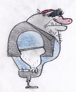
The most fun would have to be exploration of the character, figuring out who he/she is. I love working rough with a big fat pencil! Going with my gut feeling I’ll sculpt out many variations giving a character his/her personality. The toughest thing is making a drawing that is genuinely funny. It’s all proportions, Craig Kellman is a genius at that. Working with him I learned a great deal about that side of design, but it‘s still something that I have to continually work at. If I can create a sketch that will get a laugh before it’s animated then my job is done and it will only plus the animators actions.
What are some of your favorite character designs and least favorite, which you have seen?
Toot, Whistle, and Plunk has some of my favorites, Scar in Lion King, Medussa, Tex Avery‘s short with that pygmy, man I could go on and on, there are so many great designs out there. My least favorite designs would have to be Rugrats, Bevis and Butthead, and Aqua Teen Hunger Force. Sorry fellas!
What is your most favorite subject to draw? And why?
I love drawing villains. Villains seem to flow out a lot easier then the cute ones, maybe it’s because there’s a little bit of that dark side in me…hehehehe… Naw! Really it’s the mystic and power a villain presents when you put the right lines together.
What inspired you to become a Character Designer?
Those WB Classics! Those were and to this day the best! There’s so much personality in those characters.
What are some of the neat things you have learned from other artists that you have worked with or seen?
Work loose and draw a lot of thumbnails. Don’t get married to a drawing before it’s been thoroughly worked out. Continually play with proportions contrasting the shapes, and detail, not meaningless detail, but detail that enhances the sketch.
What wisdom could you give us, about being a character designer? Do you have any tips you could give?
Draw, draw, draw! If your sitting in front of a TV, or sipping a latte at coffee shop, interpret what you see in your own way on some paper or your digital notebook. Just remember the more you draw the sooner it becomes second nature. Ha! I’m still going through that faze myself. Don’t limit yourself to one style. You should be adverse in many styles to survive in this completive field, it’ll only make you more valuable as a character designer.
If people would like to contact you, how would you like to be contacted?
My Blog- http://bushiboy.blogspot.com
My e-mail- sillil71@yahoo.com
Finally, do you have any of your art work for sale (sketchbook, prints, or anything) for people that like your work can know where and when to buy it?
Sorry, nothing at this time.
Subscribe to:
Comments (Atom)
